
Case study · 2020
Real estate auctions
Mobile app concept
An online real estate auctions mobile app created as part of an intensive UX course at xLabs Budapest — an 11-week project from research to mid-fidelity prototype.

I participated in an intensive UX course at xLabs Budapest, working on an 11-week project from the research to the mid-fidelity prototype phase. I was a member of a team of four students led by a mentor, an active professional in the UX field. We worked closely together, each of us taking part in every aspect of the process.
To get to know more, watch the recording of our final presentation (in Hungarian), or read more about each phase of the project below.
Context
01Our hypothetical brief was to create a mobile app for online real estate auctions for the Hungarian Chamber of Judicial Officers (MBVK). Our tasks included defining the potential target group and their needs, creating a solution for bidding and buying, and displaying the properties’ information.
The Hungarian Chamber of Judicial Officers deals only with court-enforced real estate auctions, a distinctive and somewhat hidden section of real estate trade with its own elaborate legal rules. This made it really interesting to fully understand the field, and challenging to find the potential users of the app. Legal restrictions also gave our project a real-life vibe, representing annoying but unavoidable obstacles that could occur on a production project as well.
Discovery
02Desk research findings
During our desk research we found out that MBVK conducts around 2,000 court-enforced real estate auctions annually, which are a lot different from ordinary sales. They are considered risky and sometimes slow business, but offer an opportunity to obtain property (or a share of the ownership) at a favourable price.
MBVK’s auctions usually happen when property owners collect debt they cannot repay, so the court puts their property up for auction to cover the loan with the price it gets for the asset. This means that the initiators of the sale are not the owners themselves but the court — and this has an impact on potential buyers too:
- Lack of information — residents have the right to refuse anyone entry to their property, which means bidders can sometimes only observe it from outside. Usually only basic information is available about the building’s condition.
- Moral dilemma — owners are in a difficult financial situation, which might pose a moral dilemma for those who want to take advantage of this opportunity.
- Legal battles — even when the auction is over, owners might be reluctant to move out, which can lead to year-long legal battles before the winning bidder can take possession of the property.
- Fragmented ownership — in lots of cases not a whole property, only a share of its ownership is for sale.
The whole auction process is strictly regulated — with multiple registration processes and several rounds of bidding — and communicated in incomprehensible jargon that scares people off from participating.
Interviews
We organised user interviews with 8 individuals and 3 field experts to get to know our potential users better. I conducted some of the interviews and was an observer and note taker in others.
We invited people who had recently been involved in any kind of real estate purchase and asked them about their previous auction experiences. We realised that our first round of recruitment was a bit vague and that the specificity of the topic needed more experienced interview subjects, so we recruited 3 additional experts: an executive specialist from MBVK, an investor who built his portfolio on such auctions, and a real estate agent.
We were curious about their struggles and excitements during the auction process, and the way they search for real estate.
Personas
In the synthesis phase of the research we used individual and joint empathy maps and an affinity diagram to make sense of our data. We identified patterns with the help of behaviour variable mapping:
- hesitant — confident
- private use — investment mindset
- willing to renovate — only good condition
- cares about the moral aspect — not bothered by it
- uncertain — well informed about the process
- independent — needs a real estate agent
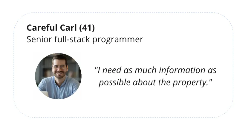
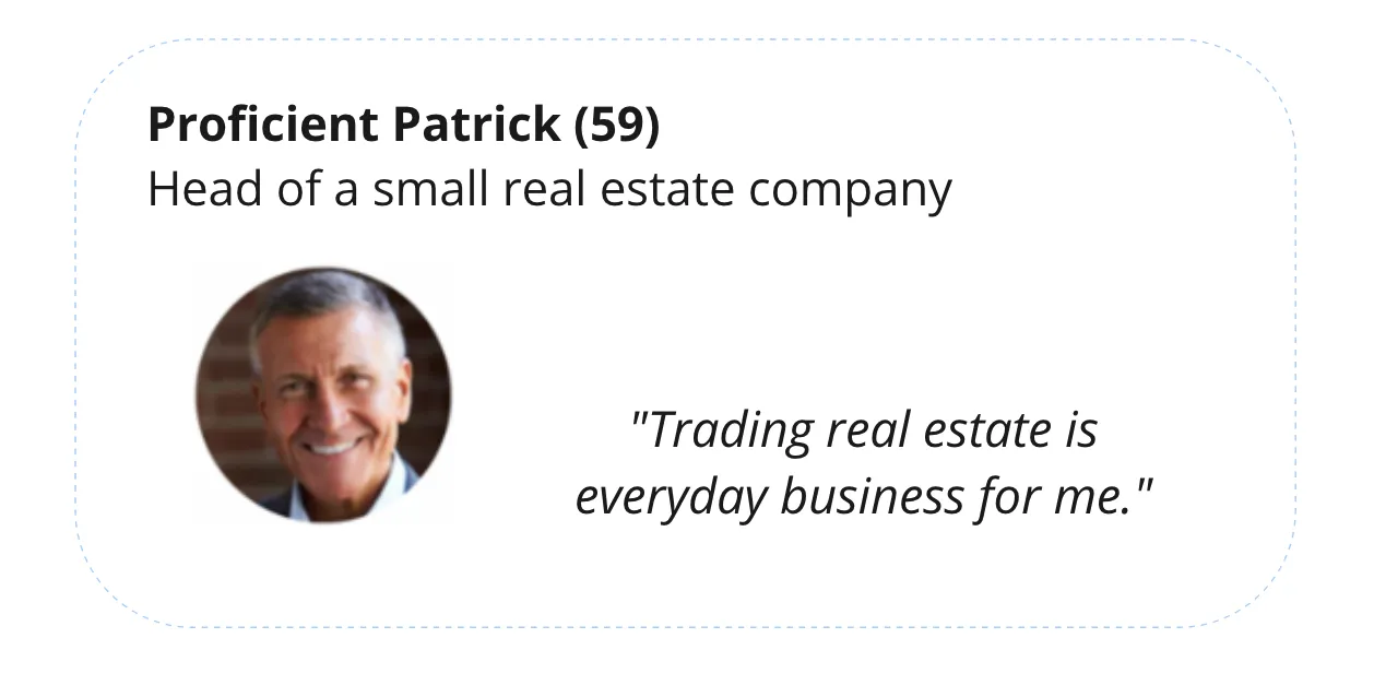
As a result we created two distinct personas, Careful Carl and Proficient Patrick.
Careful Carl has savings that he would like to invest, maybe in real estate. He is not familiar with the auction process and feels a bit insecure about it. He does not want to take high risks, so he wants to gather as much information as he can to reduce them. He is not really bothered by the moral aspects of enforced auctions.
Proficient Patrick is a lot more experienced than Carl when it comes to auctions. As a professional real estate handler he knows a lot about the process and makes confident decisions based on his expertise. Efficiency and timing are important for him.
At this point we realised that by making the auction process more accessible for users like Careful Carl, we would increase the competition and therefore spoil the business for Proficient Patrick! To make a decision, we referred back to our brief: our client’s aim is to close as many valid auctions as possible, with the highest bids possible. For this reason we put Careful Carl’s interests first to broaden access to the auctions, but kept Proficient Patrick in mind while creating the features.
User journey
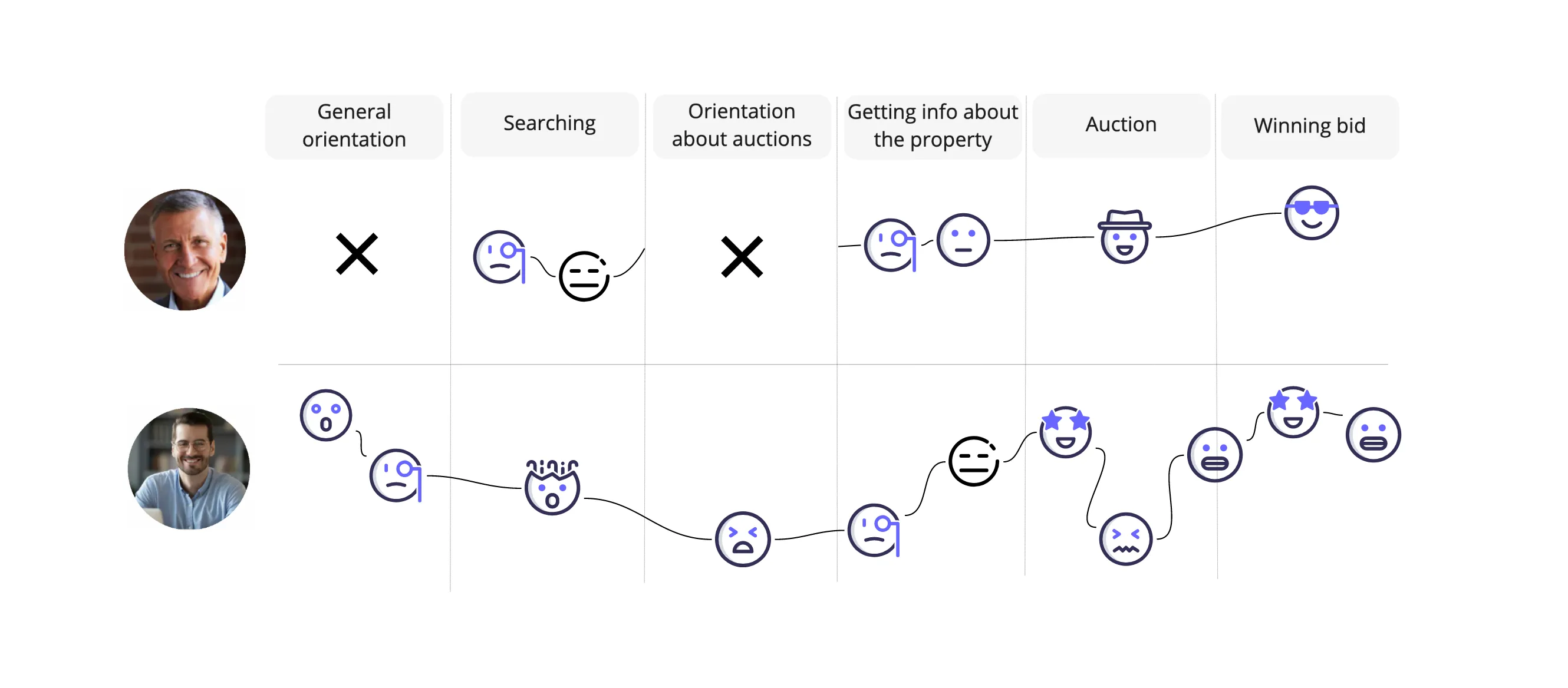
We mapped out the users’ steps to see how we could simplify their journey and help them reach their most important goals with the product.
How might we…?
Based on the journey diagrams, we identified the pain points: for both personas it was the searching, and Careful Carl also had low points during the orientation and the auction process. We worded questions about how to address these pain points for both personas:
- How might we shorten the time spent searching?
For Careful Carl:
- How might we lower his insecurity during the process?
- How might we make the process more transparent?
- How might we make the language more comprehensible?
For Proficient Patrick:
- How might we make new auctions easier to reach?
Design
03Challenges
We started creating our first designs under heavy time pressure. Despite the high complexity of the application, we decided to cover the whole flow and work it up to a mid-fidelity state. We designed solutions for:
- search
- displaying the properties’ data
- the user’s profile
- registration
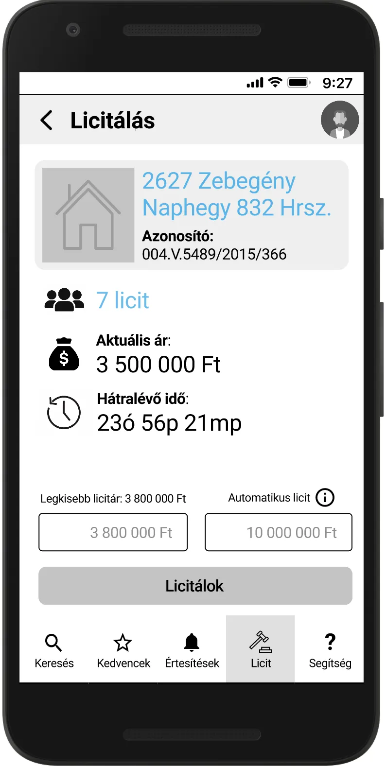
- the auction process
- payment and next steps
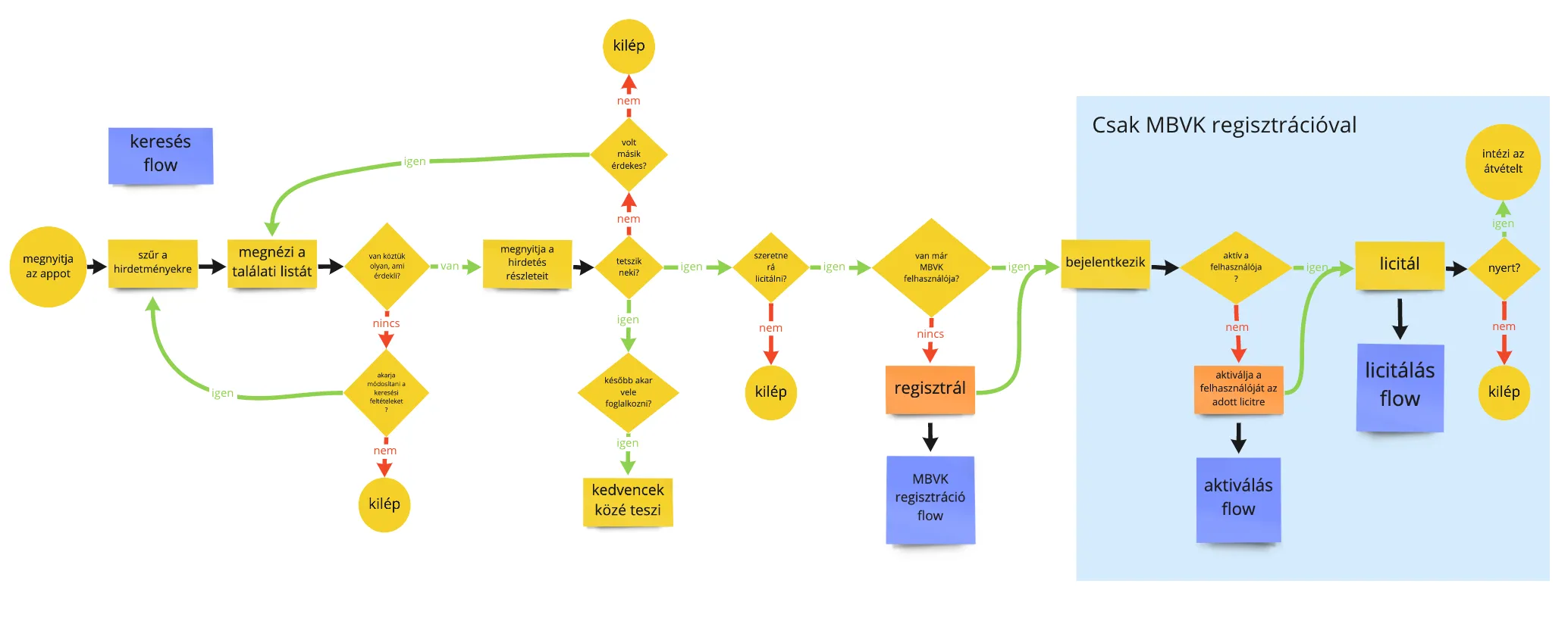
Our primary focus was on lowering uncertainty for the users. We did not want to achieve this with a separate onboarding process, but decided to ingrain guidance in every part of the app: comprehensible language, info prompts where necessary, easy navigation, and a flow that leads users through the process naturally. Besides the info prompts, we collected the auction-related knowledge under a menu item, so that users can reach the whole knowledge base and learn more if they wish.
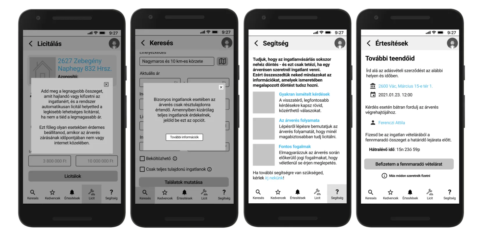
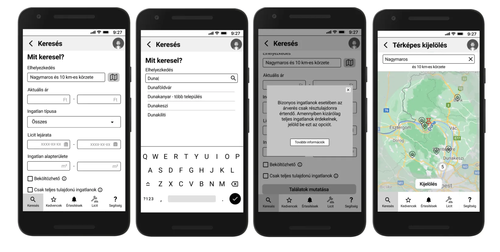
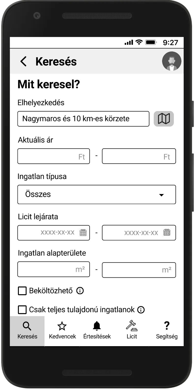
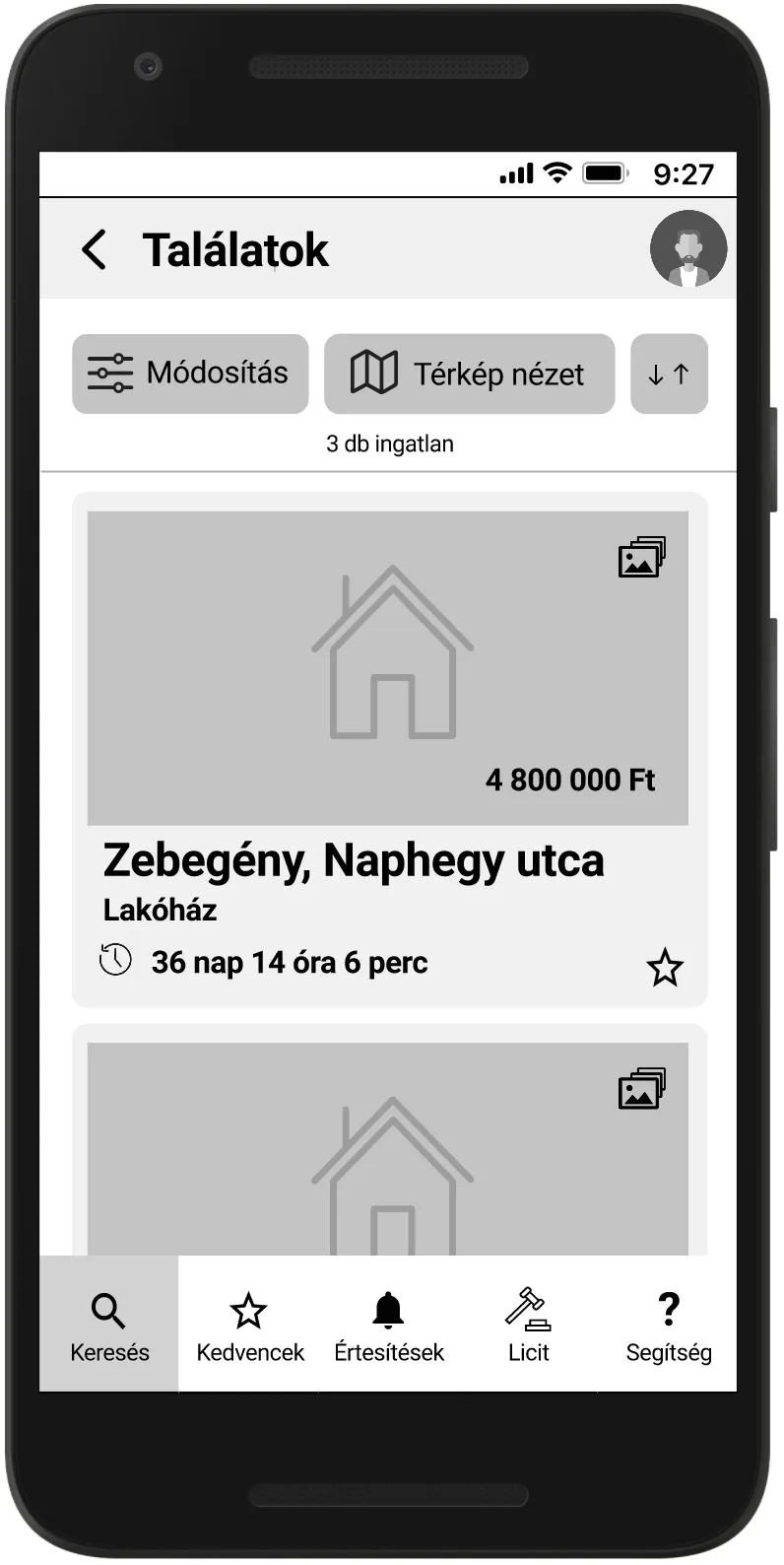
The other important area was search: we borrowed best practices found during the research phase, included filters that are useful in the auction context (e.g. the 100% ownership filter), added regions to the text-based search, and made searches saveable for easier detection of new listings.
Usability tests
We started conducting usability tests in parallel with creating the first wireframes in Figma, and ran 9 of them altogether. Participants were recruited to fit Careful Carl’s persona and were asked to search for a weekend house, choose a listing and save it for later, look up the meaning of an auction-specific expression, and then win an auction. Our primary focus was on the search area, how self-explanatory the process was, and the navigation in the app.
We iteratively adjusted the app based on the feedback we received. Here are some examples we particularly liked.
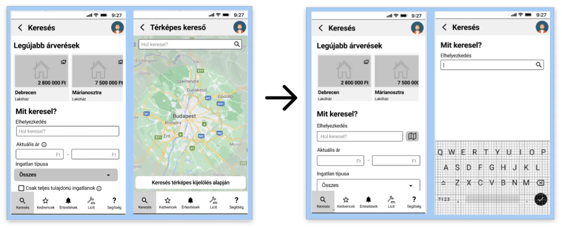
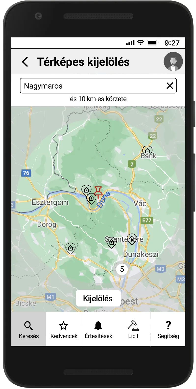
From the interviews we already knew that the most important feature of a property is its location, so we assumed users would want to start with a map search right away. Feedback from the usability tests taught us that although map search is important, users prefer a purely text-based search first. We modified our solution so that map search is reachable through a separate button, and the primary search field remained text-based.
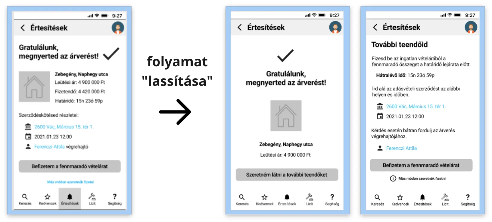
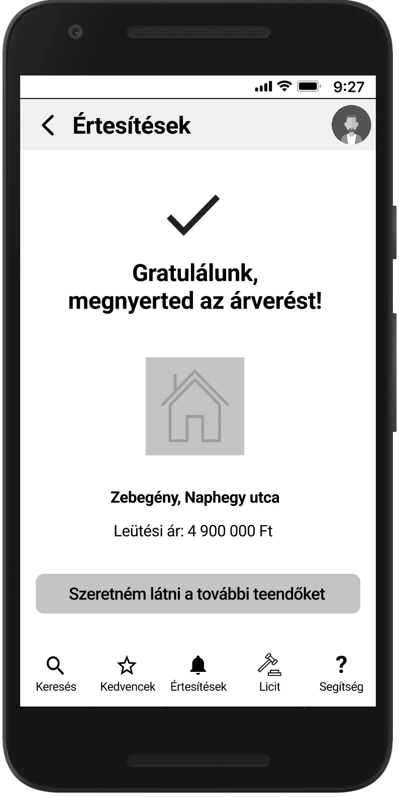
Another lovely piece of feedback was that upon winning an auction, users felt there was not enough time for celebration. In the first iteration we placed all the details of the next steps on the winner’s screen, which urged users to rush on and focus on the next tasks. To put more emphasis on the joy of winning, we slowed the flow down a bit by splitting the screen in two: now we first display the happy news, and the details of the coming steps only follow on a separate screen.
If it was to be continued…
04Eleven weeks was only enough to get us this far. With more time, we would have tested whether the app needs a separate opening screen (now the search screen acts as an in medias res opening screen). We also thought about animating the auction process to make it more of an experience, and it would be beneficial to elaborate on the registration process to digitise more of the currently offline steps.
Methods
- Affinity diagrams
- Best practice analysis
- Empathy map
- How might we…? questions
- Job stories
- Problem statements
- Prototyping
- Usability testing
- User interviews
- User journey map
- User personas
- Wireframing