
Case study · 2025
Digital banking ecosystem
UX/UI assessment
A research-led UX/UI assessment that helped a Hungarian bank prepare for potential future design endeavours by identifying the key structural, usability, and visual issues across its mobile and web banking platforms.

Why this case matters
This case reflects how I work best in complex product environments — breaking down messy problem spaces, identifying the patterns behind scattered issues, and turning research into clear, structured, usable direction.
Context
01The bank wanted to assess the current state of its mobile banking app and NetBank platform to identify opportunities for improvement across usability, navigation, transaction flows, visual consistency, and feature discoverability.
The assessment covered both retail and business banking use cases, including account information, transfers, card limit modification, authorisation, notifications, community features, and the relationship between mobile and web banking.
The project combined stakeholder interviews and a workshop, an expert UX/UI review, information architecture analysis, and user research with retail and business customers. The outcome was a structured recommendation package and severity-priority matrix to support product and design decisions across the MobilBank and NetBank ecosystem.
Process
02We started the project with a series of stakeholder interviews to understand internal expectations, priorities, and open questions around the future of the MobilBank and NetBank experience.
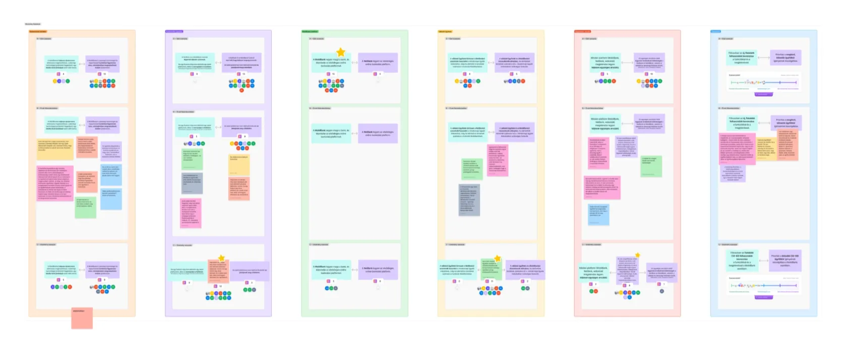
The interviews helped clarify where stakeholders were already aligned, but they also surfaced several important questions where there was no clearly articulated direction yet. Based on this, we proposed and facilitated a stakeholder workshop where the team could discuss these unresolved questions together and move toward shared decisions. This helped the client not only clarify the product direction, but also improve their internal alignment around the next phase of the work.
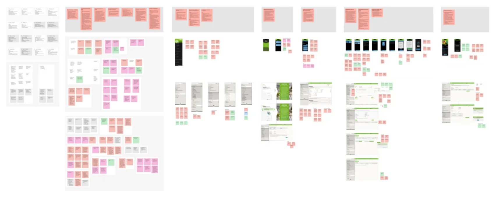
In parallel, we conducted an expert UX/UI review of the MobilBank and NetBank interfaces. To keep the findings understandable and easy to hand over, we grouped the observations into three main categories:
- UI problems — issues related to visual style, aesthetics, visual consistency, and the overall look and feel of the interface.
- UI–UX boundary problems — where visual inconsistencies made the product harder to use. These were issues where form and function were tightly connected: component logic, interaction feedback, visual hierarchy, surface-level consistency, and how clearly the interface communicated what users could do.
- UX problems — issues related to understandability, logic, navigation, interaction, information architecture, and how easily users could interpret what was happening on the screen.
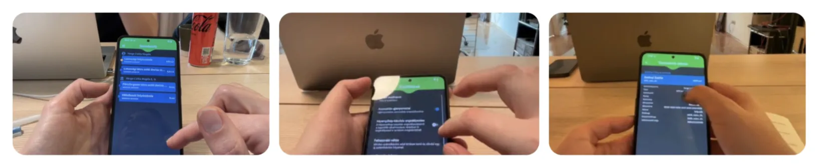
After the expert review, we conducted user research with participants across retail and business customers. The sessions combined user interviews with usability testing on the live MobilBank and NetBank interfaces. The goal was to validate and enrich the expert findings with real user behaviour, while also creating a baseline that could later be used as a benchmark for a redesign. This research helped us identify the biggest pain points, collect additional insights for the matrix, and better understand which issues carried the most weight.
Challenge
03The main challenge was that the product was not simply outdated visually — the issues were systemic. The existing experience combined navigation complexity, inconsistent terminology, hidden or underused features, fragmented interaction patterns, and platform-level differences between the two platforms. At the same time, the bank’s strongest differentiator — its community and social impact focus — was highly valued by users, but not visible enough in the digital experience.
This meant the work had to go beyond surface-level UI recommendations. We needed to connect stakeholder expectations, user behaviour, product logic, and visual/interface quality into one coherent set of priorities.
Outcome
04The project resulted in a prioritised UX/UI assessment report that connected stakeholder expectations, expert analysis, and real user behaviour.
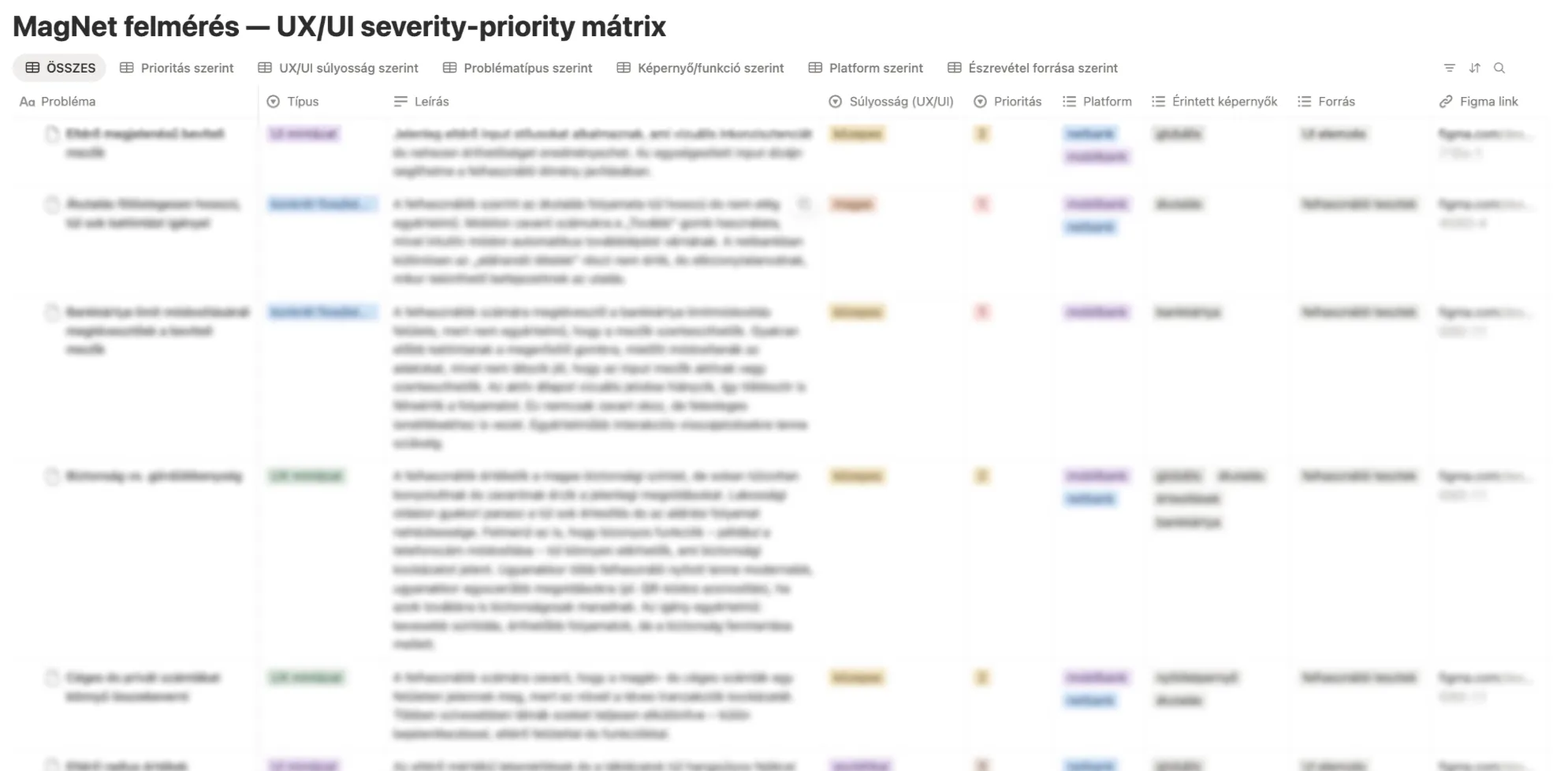
To make the findings usable for the client, we organised them into a severity-priority matrix, connecting each issue to its impact and source. This helped move the conversation from “here are many things that could be improved” to “these are the issues that matter most, and this is why.” It was not intended as a final, closed list, but was intentionally left open for the client to later add development estimates and business priorities — making it useful not only as a research output, but as a practical planning tool.
My role
- Structured a multi-method UX/UI assessment process
- Facilitated stakeholder alignment around unresolved product questions — preparing and conducting stakeholder interviews, and preparing and moderating a stakeholder workshop
- Prepared, organised, and conducted user interviews and usability testing
- Analysed both mobile and web banking experiences — reviewing information architecture, navigation logic, and interaction patterns, and identifying recurring UX patterns behind individual issues
- Synthesised findings from expert review, stakeholder input, and user research
Methods
- Heuristic evaluation
- Information architecture
- Research synthesis
- Severity-priority matrix
- Stakeholder interviews
- Usability testing
- User interviews
- Workshop facilitation