
Case study · 2022
Baby gift fund
Product optimization and feature development
UX support for a diaper gifting platform after a compromise-heavy MVP launch. After addressing issues in the existing product, I explored a new gifter-initiated feature: a way for a friend to organise a group gift on the parents’ behalf.

Why this case matters
This project demonstrates how I translate research into product direction and detailed UX design while working across product, research, and development partners. It also shows how I make scope trade-offs explicit, including which user needs a constrained solution can address and which remain unresolved.
Context
01Diaper Stash is Pampers’ US gifting platform, where friends and family contribute money to a fund—the “stash”—that new parents can spend on Pampers diapers and wipes.
The original product required parents to create a stash and ask others to contribute. Previous research had identified asking for money for oneself as a particularly uncomfortable part of the experience.
Stereogram joined after the initial MVP launch. After addressing issues in the existing product, we explored a new gifter-initiated feature: a way for a friend to organise a group gift on the parents’ behalf. This reduced the need for parents to ask for money, while introducing another challenge: helping someone coordinate the group.
Stash management ran on a third-party financial platform that restricted functionality, screen layouts, and available interface elements. Our designs also had to meet Pampers’ data-consent requirements and financial compliance restrictions.
My role
02As Stereogram’s design project lead, I:
- Planned and coordinated research into the whole group-gifting process, including activities outside the platform.
- Synthesised findings into an organiser persona and a user journey.
- Planned and facilitated a cross-functional workshop to prioritise pain points and generate feature concepts.
- Planned and coordinated follow-up research to validate problems and evaluate concepts.
- Designed the organiser, contributor, and recipient flows, wireframes, and an interactive prototype.
- Planned and coordinated usability testing.
A Stereogram colleague conducted the research studies. Saatchi & Saatchi led product management, and their designers produced the final UI. The Pampers team and development partners defined the business, compliance, and technical constraints.
Organising the group required more support than collecting the money
03We began with six in-depth interviews with US group-gift organisers, exploring how they chose gifts, reached agreements, communicated, and collected money. All six described reminding people to contribute as difficult or uncomfortable.
I used the findings to develop an organiser persona and an initial journey, then facilitated a cross-functional workshop to prioritise problems and explore solutions.
Follow-up research had two stages: problem validation with 15 participants, followed by concept evaluation with 12. Four tasks stood out as particularly frustrating:
- Coming up with appropriate gift ideas.
- Reaching everyone through the right communication channels.
- Finding out why some people had not contributed.
- Reminding those who had not contributed.
These findings made follow-up a priority for the design. Organisers needed to understand whether someone had forgotten, needed help, or did not intend to participate.
We compared automatic reminders with a participation-status dashboard showing each invitee’s status: contributed, opened the email, needed help, or opted out. Nine of 12 participants preferred the dashboard, although many wanted both.
I used this preference to shape a direction centred on participation visibility, with reminders providing additional support.
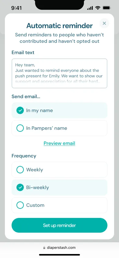
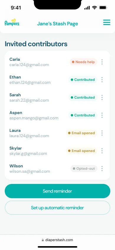
The two tested concepts: automatic reminders and participation visibility.
Consent constraints reduced the first version’s scope
04Pampers’ review established that the platform could not email people without their opt-in or ask organisers to supply other people’s personal details. The consent and contact-management infrastructure needed for the proposed invitations, reminders, and participation dashboard was not available.
This removed direct support for one of the strongest needs identified in research. I adapted the design so organisers could share a link through their existing communication channels and monitor completed contributions.
The distinction mattered:
- The proposed participation dashboard covered everyone invited, including people who had not contributed and their participation status.
- The contribution history in the reduced scope showed completed contributions only.
The first version could support collecting and presenting the gift, but organisers would still have to follow up themselves. Research made this trade-off visible: seeing who had paid would not explain why others had not.
Designing and testing the reduced scope
05I created wireframes and an interactive prototype within the financial platform’s available layouts, controls, and compliance requirements.
The design supported four stages:
- Set up the gift: personalise the stash and define the collection deadline and target.
- Invite contributions: share a link through existing communication channels.
- Monitor the collection: view completed contributions, messages, and progress towards the goal.
- Close and present the gift: finish collecting and prepare a printable gift booklet containing the collection total, contributors’ messages, and instructions for parents to claim the funds.
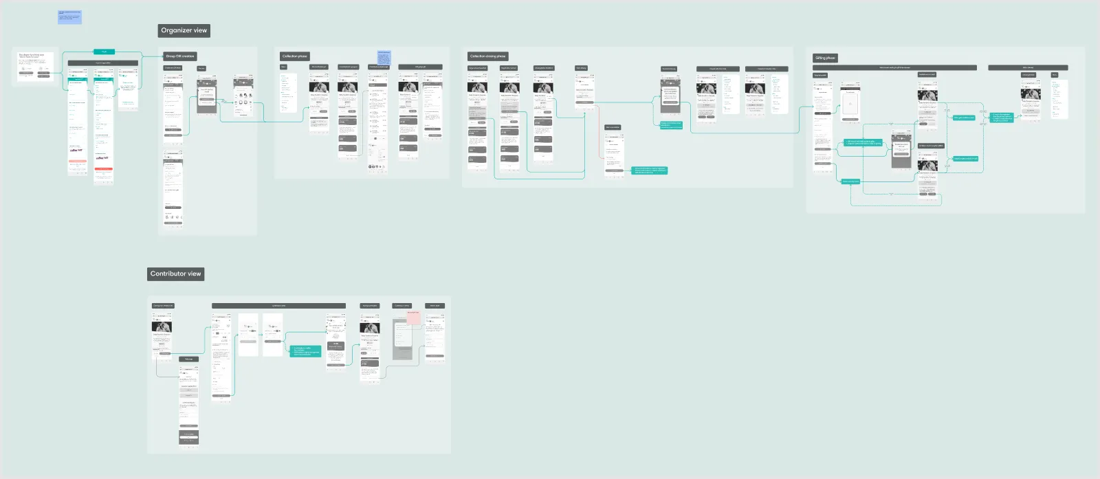
Organiser and contributor flows in the wireframes.
Making money easier to ask for and more personal to give
Within the reduced scope, we could still address several sources of discomfort:
- Pre-written sharing text helped organisers invite contributions without composing an awkward request from scratch.
- An estimated diaper-supply equivalent translated money into practical support, helping contributors judge what their gift represented.
- The printable booklet gave the organiser something personal to hand over at an occasion such as a baby shower.
Participants highlighted the booklet as an element that made the experience feel more like giving a gift.
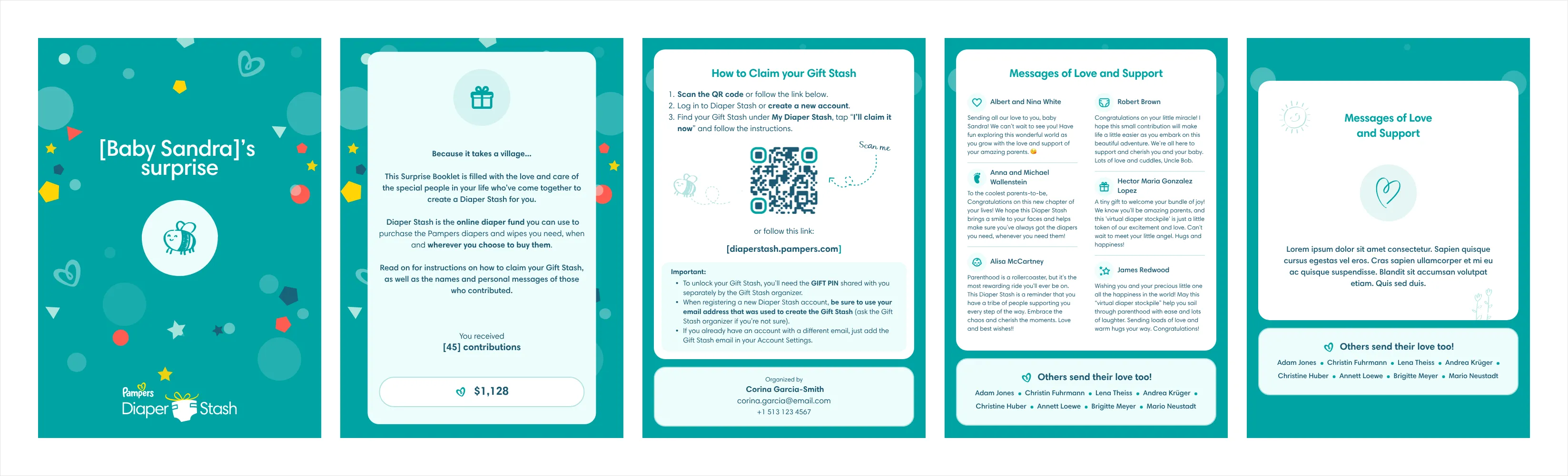
The printable gift booklet.
Testing the organising journey
I planned usability testing with nine participants. Creating a stash and sharing its link caused no observed issues, and participants could find the contribution history and progress towards the target.
Testing exposed confusion between completing and cancelling the collection. Some participants interpreted “close stash” as cancelling the gift rather than finishing the collection and preparing to give it. We revised the label to “close collection” in response.
Eight of nine participants rated their likelihood to recommend the product 4 or 5 out of 5—encouraging feedback on the tested prototype.
Outcome
06The Pampers product team accepted the designs following research, scope refinement, and usability testing. The project produced a research-informed product direction, organiser and contributor flows, wireframes, an interactive prototype, and findings that informed prioritisation and design revisions.
The client subsequently cancelled the gifter-initiated feature, so it did not launch.
Methods
- Concept testing
- Prototyping
- Usability testing
- User interviews
- User journey map
- User personas
- Wireframing
- Workshop facilitation